Thursday, December 8, 2011

Surprise in the Midst of Drought, Number Two

Surprise in the Midst of Drought, #2


This is the second quilt I have made based on the photo I took during the hot summer drought of some brave little wild flower survivors!  A friend like my original quilt so much that she asked if she could buy it.  I didn't want to part with it, since it was the one I had done for my Material Mavens group, but I told her I'd love to make a second one for her, as a gift, not for her to purchase.

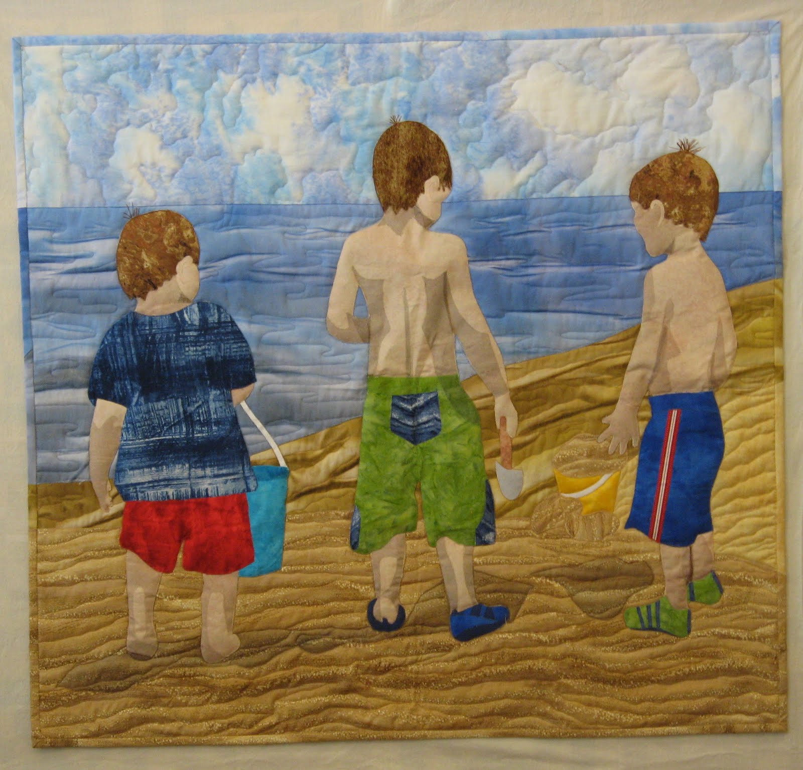
 I had lots of fun making the second quilt!  This is the second duplicate quilt I've made this year; the first one was the Michigan Beach Boys quilt, which was different in several ways from the first.  This one, too,  is NOT an exact duplicate.  I used the photo to guide me, not the first quilt.  So the flowers appear in different positions, and I included more of the green leaves.

Just to compare, here is Surprise in the Midst of Drought, Number One below.  I took this photo outside, and it's interesting to me that the hand stitching seems to show up so much better in this one than in Number Two:

Surprise in the Midst of Drought, #1

So now I'll who a photo of Number Two, taken outside, to see if the stitching shows up better than in the one I took inside, beside a bright window, using no flash.  Here's the outdoor shot of #2.  The colors are truer; definitely, I need always to take these little quilt's pictures outside on a bright, sunny day:

Outside shot:  Surprise in the Midst of Drought, #2


And now, just for fun, I'll reprint the photo on which these two quilts are based.  As you can see, I took great liberties with how I interpreted this photo in my little quilts.  In neither are the flower positioned as they are here and I didn't include nearly as many of the green leaves:


Saturday, November 19, 2011

My Surprise Quilt for Material Mavens

"Surprise in the Midst of Drought" is what I named this quilt


Last Tuesday, November 15th, was the second "reveal day" for  the international art quilting group of which I am a member, The Material Mavens.  Our first theme was Harmony; this second one was Surprise.  I based my little 12"x12" quilt on a lovely discovery I made on September 16, the day after our first reveal.  It was still hot, still summer here in Texas, so I set out on a walk very early in the morning.  Just a block from my house, I saw in the middle of a patch of weeds some little wild flowers blooming.  We'd not had rain for months!  How could they have survived?  I thought about these flowers while I walked, and then realized that they could be turned into a quilt on our new theme, Surprise.  So I went back home for my camera and took several photos.  The one I liked best was this one:


I used batiks for most of the dead weeds and also for the flowers' living ones and for the flowers themselves.  A fusible web was added to the fabrics before I sliced them into various lengths and widths, and then I fused them to the background fabric, which was a left over piece from the fabric I painted for the Three Boys quilt--the beach fabric.  I couched two different yarns to for more weeds, and after I cut free hand some flowers and leaves, I appliqued them by machine with a tiny zig zag stitch.  Then I used an embroidery running stitch and embroidery floss for the quilting.

I will post on our Material Mavens blog some additional "process" photos, and more details about the construction of this little quilt.  But here are a few photos of the quilt in process:

fusing the first weeds down to the background

couching the gold yarn for more weeds

couching the brown, "hairy" yarn

appliqueing by machine the flowers and leaves

a close-up of the embroidery stitches  used for quilting this piece

Sunday, October 2, 2011

Three Lake Michigan Beach Boys Quilt --Now in its Home!


This is the quilt that I have posted about earlier at great length!  I wrote 11 posts about the construction of this quilt back in July and August.  As discussed no doubt there, this is the second quilt I've made, based on a photo taken by the mother of the two little boys on the left five years ago.  I gave the quilt to their mother, our daughter Susan, for a recent birthday. Now the quilt is hanging in her home, upstairs in the playroom, a wonderfully sunny sort of loft area that all the bedrooms and the stairway open into.  It is hanging above a sofa that we gave to Susan many years ago, when she started graduate school in North Carolina and had almost no furniture to furnish her apartment.  This sofa has had so many different reupholsterings!  For years it was in our den in our old house.

It is exciting to me to see this quilt now in its new home!  This is such an appropriate spot for it, and I think it looks great hanging here.

Thursday, September 15, 2011

My First Material Mavens Quilt--Asian Harmonies


This is my quilt for my new Internet Art Quilt group, The Material Mavens.  Our group is made up of 12 art quilters from the East Coast to the West, down to Texas, and across the Atlantic to Scotland.  We make 12"x 12" quilts based on themes chosen in turn by our members.  Our first theme was Harmony.

I debated many ideas and designs before finally settling on this one.  Here I sun-printed the Chinese characters for harmony on some fabric that I had just painted, using a combination of two blues and black, acrylic fabric paint.  To do this, I cut out the characters from craft foam and laid them onto the background and then placed the fabric in the sun.  As hot as it's been, and as bright as the sun, the printing process took very little time.

Then I cut out from commercial fabrics the Yin-Yang and fused first and then appliqued it with a small zig zag stitch to the background.  Next from some lovely Asian-themed commercial fabrics I cut out two Koi, whose tails and bodies just fit each side of the Yin-Yang.  I used the same fusing and applique methods as before.

I backed the quilt with some blue fabric that is printed with Chinese characters--who knows what words are used there!  I used the pillow case method of finishing the edges.

a close-up view of the sun-printed Chinese characters for Harmony

A close up of my two koi

The back of my quilt

Tuesday, August 23, 2011

Katie Pasquini-Masopust's Latest Book

I took a class from Katie PM in 2009.  What a class and what a teacher!  Katie's latest book is now out:
INSPIRATIONS IN DESIGN FOR THE CREATIVE QUILTER.  I am particularly fond of this book because (1) the methods taught in the book are those that Katie was teaching our class and (2) my quilt that was started in her class appears on p. 24!  It is most exciting to me, a novice art quilter, that one of my quilts is now "out there" in a book by a well-known and highly-respected quilt artist and teacher.

I discussed this quilt in an earlier post:

http://artquiltaspirant.blogspot.com/2011/05/art-quilt-two.html

Here's a photo of the quilt as it looks hanging in our bedroom.  You can't tell from the photo, but our walls are painted a pale aqua.  I love the color obviously!


Monday, August 8, 2011

Portrait Quilt: Part Nine--Finished at Last!

Today was a red letter day.  I finished sewing down the binding on the back of the quilt.  My good friend Judy quilted it for me.  I had quilted the first quilt I made from this photo, but time was running short and I had another quilt to finish for yet another birthday present.  (This portrait quilt is for our daughter's 40th birthday.  Her two sons are the little boys on the left, with their cousin on the right.)

Anyway, here it is, finished at last!


And now, here are some close-up views of the quilt:


Saturday, July 23, 2011

Portrait Quilt: Tweaking at the End: Part Eight

And I just thought I was done!  Taking a new look at my pictures, which always reveal more than seeing a quilt "in person," somehow, made me realize I was not happy with the shadows on the boys' necks.  Too, a sharp-eyed friend noticed a problem with Locke's profile.  She was so right!  He has a distinct profile, a strong chin, high cheek bones, etc.  I made his forehead come forward too much and his cheek bones recede.  How could that have happened?  Was my tracing at fault?  No, it turned out that I erred in my cutting out, as the tracing was correct.  So I did a lot of picking out of threads, taking off of tulle, recutting tulle and refusing it, etc. etc.  For Locke I made a new partial pattern and re-cut the front of his face.

Here are the results, and hopefully now I'll be content:  


The quilt as a whole

Close-up of Locke.  I reshaped his profile in rather
subtle, but to me important, ways.
Added a darker shadow under his chin.
This is pinned at this point; not yet
appliqued down.

The shadows on Dawson at left and Malcolm at
right are also subtly different.  Still
not "perfect," but better!

Friday, July 22, 2011

Portrait Quilt Appliqueing--Part Seven, Constructing a Portrait Quilt

This is my last day to work on this quilt for awhile. On Sunday I hand it over to my good friend Judy, who often does my machine quilting for her.  Not only is she reasonable, but she's the best free motion quilter I've ever encountered!  When she's done, I'll add the binding, using the same special, Marcia Stein, method that I used on the first quilt.  This was a topic of the one post I put up on this blog in June.

Today I finished up the appliqueing.  This to me is a fun part of this process!  I don't like changing thread colors so often, but except for that, it is enjoyable. I used something like 16 different threads for this stage of construction.  Following Marcia Stein's instructions, I use a tiny zig-zag stitch, matching the thread color to the section being sewn down. 

I also did a bit of "thread sketching" today, on the tops of all the boys' heads.  All had some "Denice the Menace" sticking-up hair.  Locke's was particularly dramatic!  Here are some photos:

This shows the appliqueing on some of the
smaller areas of the quilt.  It's also a good
one to illustrate thread colors:  7
different ones here!

More of the detail work

Note the thread sketching of Locke's "top knot"!
And here, the thread sketching on
Dawson and Malcolm


Here's the quilt as a whole,
now appliqued at last!


Monday, July 18, 2011

Portrait Quilt--Part 6.5--Continuing with the Shading

The shadows/shading with fused-down tulle went faster than on my first quilt, probably because I have the process down pat.  I prepare a good-sized piece of brown tulle with the Misty Fuse on the back.  Again, I sandwich the two of these between two sheets of parchment paper.  I use a medium hot iron, and I count to 10 before I move the iron.  This seems to work to adhere the fusible to the tulle yet not to melt either the tulle or the fusible--both are meltable!

Then I trace on freezer paper's dull side the shapes of the various shadows, using my original cartoon enlargement.  After cutting out around these patterns, I place them on the prepared tulle, top it again with parchment, and iron once more, about the same length of time.  Then I cut out the shapes.  I have learned to let the freezer paper cool totally before removing the pieces from the ironing board; it seems to stick better when I do that.

Then I carefully remove the pattern from a shape, place it where it belongs, and then do a third ironing, again using the parchment on top and underneath, to adhere it to the figures where needed.

Here is the quilt, shading in place on the boys, pinned to the now-sewn background.  Where you see some pins sticking into the shadows--those are places where I have added additional tulle and not yet ironed them down.

PS  I've had to clean my iron with the product I mentioned several posts back.  No matter how careful I am, inevitably I get fusible on the iron.

The entire quilt, background now sewn,
shading done on the figures.

Close up of the two brothers.  Dawson
on the left was barefoot, and
getting his feet to look "right" was a challenge,
but I like them better here than
on my first quilt.   Especially
 when the quilt is viewed from
a distance, it looks quite like
he is up on his tiptoes on his left foot!

I had fun designing the shoes for the two
boys who are shod!

Saturday, July 16, 2011

Portrait Quilt--Part Six--Shadows and Shading

The last couple of days have been spent finishing up the background painting and experimenting with various ways to put shadows and shading on my figures.  On the original quilt, I shaded with tulle fused onto the little boys' figures and made shadows beneath them, on the sand.  This is effective, but very tedious!

I wanted an easier method, so I tried three, and I was happy with none!  First I tried using water color pencils, but that to me didn't look natural.

A "posterized" gray scale version
of the original.  This helps
me to see where the shadows
should be placed.  They can
clearly be seen, both on the sand and
on the boys' bodies.
Next I tried painting with acrylic paints, using the methods and suggested colors discussed in the book PORTRAIT QUILTS, PAINTED FACES YOU CAN DO by Bonnie Lyn McCaffery.  I am sure McCaffery's methods and very clear directions work wonderfully well on most front-view portraits, where the highlights and shading appear just here and there on a face.  But when an entire face is in shadow, as is Locke's on the far right in my picture--well, it just didn't seem to work for me!

Finally I tried tea-dyeing my fabric, planning then to cut the shadows from this darker shade.  Again, I used McCaffery's directions, but despite leaving the swatches in the tea longer than she suggests, it had absolutely NO effect on this fabric!  Perhaps had I washed the fabric first, it would have taken to the tea dye better.

Because of my experiments with both the colored pencils and the paint, I had then to start from scratch with Locke.  I cut out a new cloth "paper doll" for him, though of course I could re-use his hair and his shorts.  (This time, I remembered to adhere the Misty Fuse first, on the back of the flesh-colored fabric, before cutting out the pattern.)

And so now I am back to using brown tulle, fused on with Misty Fuse.  This method, after all, is the best.  Yes, tedious, but also effective!

And so here is a picture of the in-progress quilt.  In it you can see that I have begun the shadowing on Locke--on his face, arms, and torso.  Also you can see the final decision about the background.  I am using the painted sky, water, and some of the beach fabric.  But to achieve the look of the beach that I wanted, I used two commercial fabrics as well.  The fabric on the bottom is the commercial one called "sand", and then the one just behind Locke is a fabric that just seemed to coordinate well with both the painted fabric and the bottom one.

If you compare this photo of the quilt with
the posterized version above, you
can tell how I get the shape and the
placement of the shadows.
    

Wednesday, July 13, 2011

Fabric Painting--Part 5.5 Constructing a Portrait Quilt

I was up bright and early, raring to get back to my fabric painting.  I began with the water.  I made it much bluer and darker, putting a bit of gray in the area that will be behind Dawson's tie-dyed shirt.  I put in a few lines of white paint for the waves, and all of it had a bit of shimmer paint in it, which I think definitely enhances it.

For the sky I painted the new fabric much as I did the first sky, but I was more careful to make the two shades of blue more pronounced.  The first one had two shades as well, but the second color didn't show up well.  I also left more white areas for clouds.

Here are photos of my morning's effort.  I've pinned up "stand-ins" for the sand, just to get a better idea of how the finished quilt will look.  I still so love that commercial sand fabric that I used in my first quilt, that I might go out and buy more, to use in combination with what I paint.  A bit of it is under Dawson, on the far left.  The painted sand is under Locke's feet and one of Malcolm's, in the middle.

[ "Malcolm in the Middle"--huh, funny.  That just now hit me!  (Daughter says she get's awfully tired of people asking her if her sons were named for the TV shows "Malcolm in the Middle" and "Dawson's Creek".  Other daughter wearies of people asking HER if Locke was named for the "Lost" TV show character of that name.  ALL are family names!)]

I've taped up some blue painter's tape to show where the
sides and bottom of the quilt will be eventually.

Why was I so worried about Dawson's shirt not showing up?  Just
by lightening the blue water a bit, it shows up well,
but you can see here that I did put touches of grayish blue
in this part of the water and repeated it a few other places as well.

This shows the sky really well and the lake water, too.
Remember:  I've still not put the shading and shadows on the
boys' bodies.  And shadows will go eventually
on the sand as well.

Monday, July 11, 2011

Fabric Painting: Constructing a Portrait Quilt--Part Five

Today was my painting day.  I had mixed success.  I practiced first with the sky fabric on two small swatches.  Then I painted the sky on fabric of the right length, but I liked my practice pieces better! Then I painted the water, and I was not at all happy with it. Next I practiced again with a totally different mixture of colors for the sand.  The small practice swatch for the sand turned out well.  But now I'm not sure I remember just what the mix of paint was for that.  I was tired by that point and not paying much attention to my mixing, just a dab of this and that.  I need to achieve two or three different colors of sand, however, so perhaps the small piece will work for the smallest area of sand.

The book SKYDYES by Mickey Lawler is excellent, and without it I wouldn't have known where to start.

I'm eager to get back to this as soon as I can.  Meanwhile, here are my results,  some so-so, some not even that, and one I really like!

The sky piece--this is okay, but I think I can do better, so
I'll probably do yet another piece for the sky.


My water--definitely unhappy with this.  The color will allow Dawson's
shirt to show up, but that's about all positive that one can say about it.  I think I can
do better next time!  I need to keep the base color gray, but I
think some darker lines of water and some lines of white for waves will
greatly improve it.

The sand.  Very happy with this.  Just hope I can replicate the color when I paint
a larger piece of fabric!

Sunday, July 10, 2011

Constructing a Portrait Quilt--Part Four

My latest work on this quilt was fusing and tweaking.  I made a serious mistake not to adhere the fusible (I like Misty Fuse the best) to the various fabrics before cutting out the patterns.  The steps ought to have been:

1.  Cut out the freezer paper pattern and adhere to appropriate fabric by ironing the shiny side down of the right side of the fabric.

2.  Rough-cut out the fabric with the freezer paper still attached around the pattern, not too closely.  Place a like-sized piece of Misty Fuse on top of the ironing board, which has been protected with parchment paper.  (I like to pin my parchment paper down on the board with straight pins.)  Take the rough cuts and place them on top of the fusible.  Cover with another piece of parchment and iron.  Don't leave the iron on too long, or the fusible will melt, but leave it long enough so that it adheres to the fabric.  Checking and experimenting is the name of the game here.  [Parchment paper is a wonderful product and does a great job protecting the ironing board and as a press cloth.  If you do get fusible on your iron, Rowenta has a great sole-plate cleaning product that really works.]

3.  Let this cool and then cut out around the edges of the freezer paper pattern.  Remove the pattern and keep it, if you think you'll make this quilt again.  At this point, I always put the applique up on my design wall.

4.  Now the appliques have fusible on their wrong side, and they are all ready to fuse, eventually, to the background.

I went about this backwards, and so had to adhere the Misty Fuse to the already-cut-out fabric appliques.  Then I had to cut carefully around all edges, making sure that no fusible stuck out along the edges.

Why didn't I do this the way I was taught to do it?  Well, I think I was too eager to begin and didn't realize that it was going to be much more tedious the way I did it this time!

I worked a lot on the boys' hair and like each one better now.  Of course, pieces such as each boy's hair, their clothing, etc.--all this had to have the Misty Fuse ironed on.  Next time I'll do it the right way!  Here are the new and improved "coifs" of the boys!


Dawsons hair

Malcolm's

Locke's

Thursday, July 7, 2011

Constructing a Portrait Quilt--Part Three

Today I followed the same procedure described in Part Two and made two more cloth "paper dolls" of the other two grandsons.  Here's an image:

Malcolm in green shorts and Locke in blue
At this point, there is no shading on the boys' bodies, and thus is is hard to see the definition of the boys' arms.  And in the case of Locke on the right, his two legs are not defined.  This will be done by adding in shadows or shading, where they appear in the photo on which this quilt is based.  None of the boys have shoes, either, but it is easier to add the shoes after the boys have been fused to the background, yet to be constructed.

Dawson
In the first quilt of these boys, I had a difficult time getting Dawson's and Malcolm's hands to look right.  I finally gave up on Dawson's on quilt #1 and just added a version of Locke's hand to Dawson's arm! One reason I wanted to make this quilt a big larger than the first, though, was to have a bit more room with which to work on their hands.  I will have to do some colored pencil or Sharpie work however, to complete the hands, again to define the fingers.  Dawson's feet in the first quilt--bare in the photo--were hard, too, and I wasn't ever happy with them.  They looked more like hoofs than feet to me!  This time I may just add shoes to his feet, to make this job easier!

I did add the spade already to Malcolm, as it is crucial to have it in order for his right hand to look right.  Clicking on the photo might bring these areas into closer focus.  Here's a cropped picture of Malcolm that you might be able to click on to see better what I meant about the hand and the little spade!
Malcolm

Here's another of just Locke.  I had to do his hair twice (using some of the Stonehenge fabric mentioned in the last post), and I'm still not 100% happy with it.  At least I got the lighter areas of the fabric at the top of his head, where in the photo his hair does appear lighter.  I had to make his shorts twice, before I was pleased with the result.  I'll a bit of shading to them, too, to show where the two legs of the shorts separate.

Dawson
And now here are all three boys.  Next, I'l work on the background, but that must wait for my new fabric paints to arrive in the mail!

Lake Michigan Beach Boys