Saturday, July 23, 2011

Portrait Quilt: Tweaking at the End: Part Eight

And I just thought I was done!  Taking a new look at my pictures, which always reveal more than seeing a quilt "in person," somehow, made me realize I was not happy with the shadows on the boys' necks.  Too, a sharp-eyed friend noticed a problem with Locke's profile.  She was so right!  He has a distinct profile, a strong chin, high cheek bones, etc.  I made his forehead come forward too much and his cheek bones recede.  How could that have happened?  Was my tracing at fault?  No, it turned out that I erred in my cutting out, as the tracing was correct.  So I did a lot of picking out of threads, taking off of tulle, recutting tulle and refusing it, etc. etc.  For Locke I made a new partial pattern and re-cut the front of his face.

Here are the results, and hopefully now I'll be content:  


The quilt as a whole

Close-up of Locke.  I reshaped his profile in rather
subtle, but to me important, ways.
Added a darker shadow under his chin.
This is pinned at this point; not yet
appliqued down.

The shadows on Dawson at left and Malcolm at
right are also subtly different.  Still
not "perfect," but better!

Friday, July 22, 2011

Portrait Quilt Appliqueing--Part Seven, Constructing a Portrait Quilt

This is my last day to work on this quilt for awhile. On Sunday I hand it over to my good friend Judy, who often does my machine quilting for her.  Not only is she reasonable, but she's the best free motion quilter I've ever encountered!  When she's done, I'll add the binding, using the same special, Marcia Stein, method that I used on the first quilt.  This was a topic of the one post I put up on this blog in June.

Today I finished up the appliqueing.  This to me is a fun part of this process!  I don't like changing thread colors so often, but except for that, it is enjoyable. I used something like 16 different threads for this stage of construction.  Following Marcia Stein's instructions, I use a tiny zig-zag stitch, matching the thread color to the section being sewn down. 

I also did a bit of "thread sketching" today, on the tops of all the boys' heads.  All had some "Denice the Menace" sticking-up hair.  Locke's was particularly dramatic!  Here are some photos:

This shows the appliqueing on some of the
smaller areas of the quilt.  It's also a good
one to illustrate thread colors:  7
different ones here!

More of the detail work

Note the thread sketching of Locke's "top knot"!
And here, the thread sketching on
Dawson and Malcolm


Here's the quilt as a whole,
now appliqued at last!


Monday, July 18, 2011

Portrait Quilt--Part 6.5--Continuing with the Shading

The shadows/shading with fused-down tulle went faster than on my first quilt, probably because I have the process down pat.  I prepare a good-sized piece of brown tulle with the Misty Fuse on the back.  Again, I sandwich the two of these between two sheets of parchment paper.  I use a medium hot iron, and I count to 10 before I move the iron.  This seems to work to adhere the fusible to the tulle yet not to melt either the tulle or the fusible--both are meltable!

Then I trace on freezer paper's dull side the shapes of the various shadows, using my original cartoon enlargement.  After cutting out around these patterns, I place them on the prepared tulle, top it again with parchment, and iron once more, about the same length of time.  Then I cut out the shapes.  I have learned to let the freezer paper cool totally before removing the pieces from the ironing board; it seems to stick better when I do that.

Then I carefully remove the pattern from a shape, place it where it belongs, and then do a third ironing, again using the parchment on top and underneath, to adhere it to the figures where needed.

Here is the quilt, shading in place on the boys, pinned to the now-sewn background.  Where you see some pins sticking into the shadows--those are places where I have added additional tulle and not yet ironed them down.

PS  I've had to clean my iron with the product I mentioned several posts back.  No matter how careful I am, inevitably I get fusible on the iron.

The entire quilt, background now sewn,
shading done on the figures.

Close up of the two brothers.  Dawson
on the left was barefoot, and
getting his feet to look "right" was a challenge,
but I like them better here than
on my first quilt.   Especially
 when the quilt is viewed from
a distance, it looks quite like
he is up on his tiptoes on his left foot!

I had fun designing the shoes for the two
boys who are shod!

Saturday, July 16, 2011

Portrait Quilt--Part Six--Shadows and Shading

The last couple of days have been spent finishing up the background painting and experimenting with various ways to put shadows and shading on my figures.  On the original quilt, I shaded with tulle fused onto the little boys' figures and made shadows beneath them, on the sand.  This is effective, but very tedious!

I wanted an easier method, so I tried three, and I was happy with none!  First I tried using water color pencils, but that to me didn't look natural.

A "posterized" gray scale version
of the original.  This helps
me to see where the shadows
should be placed.  They can
clearly be seen, both on the sand and
on the boys' bodies.
Next I tried painting with acrylic paints, using the methods and suggested colors discussed in the book PORTRAIT QUILTS, PAINTED FACES YOU CAN DO by Bonnie Lyn McCaffery.  I am sure McCaffery's methods and very clear directions work wonderfully well on most front-view portraits, where the highlights and shading appear just here and there on a face.  But when an entire face is in shadow, as is Locke's on the far right in my picture--well, it just didn't seem to work for me!

Finally I tried tea-dyeing my fabric, planning then to cut the shadows from this darker shade.  Again, I used McCaffery's directions, but despite leaving the swatches in the tea longer than she suggests, it had absolutely NO effect on this fabric!  Perhaps had I washed the fabric first, it would have taken to the tea dye better.

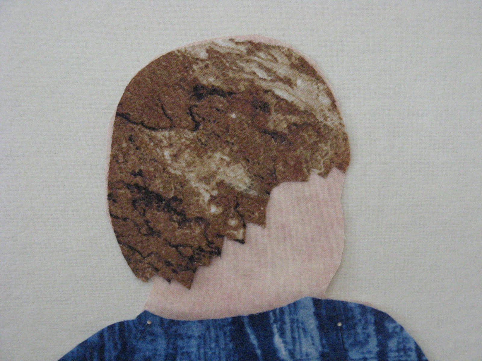
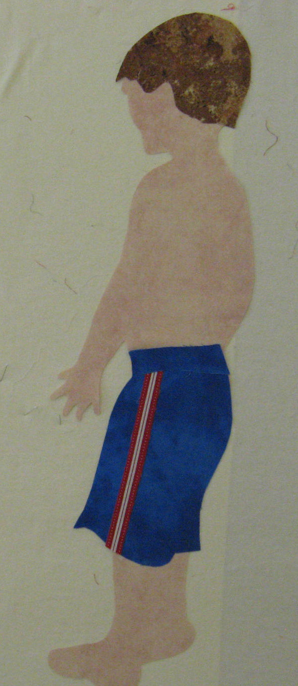
Because of my experiments with both the colored pencils and the paint, I had then to start from scratch with Locke.  I cut out a new cloth "paper doll" for him, though of course I could re-use his hair and his shorts.  (This time, I remembered to adhere the Misty Fuse first, on the back of the flesh-colored fabric, before cutting out the pattern.)

And so now I am back to using brown tulle, fused on with Misty Fuse.  This method, after all, is the best.  Yes, tedious, but also effective!

And so here is a picture of the in-progress quilt.  In it you can see that I have begun the shadowing on Locke--on his face, arms, and torso.  Also you can see the final decision about the background.  I am using the painted sky, water, and some of the beach fabric.  But to achieve the look of the beach that I wanted, I used two commercial fabrics as well.  The fabric on the bottom is the commercial one called "sand", and then the one just behind Locke is a fabric that just seemed to coordinate well with both the painted fabric and the bottom one.

If you compare this photo of the quilt with
the posterized version above, you
can tell how I get the shape and the
placement of the shadows.
    

Wednesday, July 13, 2011

Fabric Painting--Part 5.5 Constructing a Portrait Quilt

I was up bright and early, raring to get back to my fabric painting.  I began with the water.  I made it much bluer and darker, putting a bit of gray in the area that will be behind Dawson's tie-dyed shirt.  I put in a few lines of white paint for the waves, and all of it had a bit of shimmer paint in it, which I think definitely enhances it.

For the sky I painted the new fabric much as I did the first sky, but I was more careful to make the two shades of blue more pronounced.  The first one had two shades as well, but the second color didn't show up well.  I also left more white areas for clouds.

Here are photos of my morning's effort.  I've pinned up "stand-ins" for the sand, just to get a better idea of how the finished quilt will look.  I still so love that commercial sand fabric that I used in my first quilt, that I might go out and buy more, to use in combination with what I paint.  A bit of it is under Dawson, on the far left.  The painted sand is under Locke's feet and one of Malcolm's, in the middle.

[ "Malcolm in the Middle"--huh, funny.  That just now hit me!  (Daughter says she get's awfully tired of people asking her if her sons were named for the TV shows "Malcolm in the Middle" and "Dawson's Creek".  Other daughter wearies of people asking HER if Locke was named for the "Lost" TV show character of that name.  ALL are family names!)]

I've taped up some blue painter's tape to show where the
sides and bottom of the quilt will be eventually.

Why was I so worried about Dawson's shirt not showing up?  Just
by lightening the blue water a bit, it shows up well,
but you can see here that I did put touches of grayish blue
in this part of the water and repeated it a few other places as well.

This shows the sky really well and the lake water, too.
Remember:  I've still not put the shading and shadows on the
boys' bodies.  And shadows will go eventually
on the sand as well.

Monday, July 11, 2011

Fabric Painting: Constructing a Portrait Quilt--Part Five

Today was my painting day.  I had mixed success.  I practiced first with the sky fabric on two small swatches.  Then I painted the sky on fabric of the right length, but I liked my practice pieces better! Then I painted the water, and I was not at all happy with it. Next I practiced again with a totally different mixture of colors for the sand.  The small practice swatch for the sand turned out well.  But now I'm not sure I remember just what the mix of paint was for that.  I was tired by that point and not paying much attention to my mixing, just a dab of this and that.  I need to achieve two or three different colors of sand, however, so perhaps the small piece will work for the smallest area of sand.

The book SKYDYES by Mickey Lawler is excellent, and without it I wouldn't have known where to start.

I'm eager to get back to this as soon as I can.  Meanwhile, here are my results,  some so-so, some not even that, and one I really like!

The sky piece--this is okay, but I think I can do better, so
I'll probably do yet another piece for the sky.


My water--definitely unhappy with this.  The color will allow Dawson's
shirt to show up, but that's about all positive that one can say about it.  I think I can
do better next time!  I need to keep the base color gray, but I
think some darker lines of water and some lines of white for waves will
greatly improve it.

The sand.  Very happy with this.  Just hope I can replicate the color when I paint
a larger piece of fabric!

Sunday, July 10, 2011

Constructing a Portrait Quilt--Part Four

My latest work on this quilt was fusing and tweaking.  I made a serious mistake not to adhere the fusible (I like Misty Fuse the best) to the various fabrics before cutting out the patterns.  The steps ought to have been:

1.  Cut out the freezer paper pattern and adhere to appropriate fabric by ironing the shiny side down of the right side of the fabric.

2.  Rough-cut out the fabric with the freezer paper still attached around the pattern, not too closely.  Place a like-sized piece of Misty Fuse on top of the ironing board, which has been protected with parchment paper.  (I like to pin my parchment paper down on the board with straight pins.)  Take the rough cuts and place them on top of the fusible.  Cover with another piece of parchment and iron.  Don't leave the iron on too long, or the fusible will melt, but leave it long enough so that it adheres to the fabric.  Checking and experimenting is the name of the game here.  [Parchment paper is a wonderful product and does a great job protecting the ironing board and as a press cloth.  If you do get fusible on your iron, Rowenta has a great sole-plate cleaning product that really works.]

3.  Let this cool and then cut out around the edges of the freezer paper pattern.  Remove the pattern and keep it, if you think you'll make this quilt again.  At this point, I always put the applique up on my design wall.

4.  Now the appliques have fusible on their wrong side, and they are all ready to fuse, eventually, to the background.

I went about this backwards, and so had to adhere the Misty Fuse to the already-cut-out fabric appliques.  Then I had to cut carefully around all edges, making sure that no fusible stuck out along the edges.

Why didn't I do this the way I was taught to do it?  Well, I think I was too eager to begin and didn't realize that it was going to be much more tedious the way I did it this time!

I worked a lot on the boys' hair and like each one better now.  Of course, pieces such as each boy's hair, their clothing, etc.--all this had to have the Misty Fuse ironed on.  Next time I'll do it the right way!  Here are the new and improved "coifs" of the boys!


Dawsons hair

Malcolm's

Locke's

Thursday, July 7, 2011

Constructing a Portrait Quilt--Part Three

Today I followed the same procedure described in Part Two and made two more cloth "paper dolls" of the other two grandsons.  Here's an image:

Malcolm in green shorts and Locke in blue
At this point, there is no shading on the boys' bodies, and thus is is hard to see the definition of the boys' arms.  And in the case of Locke on the right, his two legs are not defined.  This will be done by adding in shadows or shading, where they appear in the photo on which this quilt is based.  None of the boys have shoes, either, but it is easier to add the shoes after the boys have been fused to the background, yet to be constructed.

Dawson
In the first quilt of these boys, I had a difficult time getting Dawson's and Malcolm's hands to look right.  I finally gave up on Dawson's on quilt #1 and just added a version of Locke's hand to Dawson's arm! One reason I wanted to make this quilt a big larger than the first, though, was to have a bit more room with which to work on their hands.  I will have to do some colored pencil or Sharpie work however, to complete the hands, again to define the fingers.  Dawson's feet in the first quilt--bare in the photo--were hard, too, and I wasn't ever happy with them.  They looked more like hoofs than feet to me!  This time I may just add shoes to his feet, to make this job easier!

I did add the spade already to Malcolm, as it is crucial to have it in order for his right hand to look right.  Clicking on the photo might bring these areas into closer focus.  Here's a cropped picture of Malcolm that you might be able to click on to see better what I meant about the hand and the little spade!
Malcolm

Here's another of just Locke.  I had to do his hair twice (using some of the Stonehenge fabric mentioned in the last post), and I'm still not 100% happy with it.  At least I got the lighter areas of the fabric at the top of his head, where in the photo his hair does appear lighter.  I had to make his shorts twice, before I was pleased with the result.  I'll a bit of shading to them, too, to show where the two legs of the shorts separate.

Dawson
And now here are all three boys.  Next, I'l work on the background, but that must wait for my new fabric paints to arrive in the mail!

Lake Michigan Beach Boys

Wednesday, July 6, 2011

Constructing a Portrait Quilt--Part Two

After I had the cartoon--the enlarged-to-final-size traced image of the photo--it was time to start tracing each boy onto freezer paper.  I started with Dawson, the little boy on the left.  Laying the shiny side down and tracing onto the dull side of the paper, I traced first his clothes and hair.  Then I went back and traced his entire body.  Of course, his body is partially covered by clothes, but I just roughly sketched the hidden areas.

Then I cut out the shorts, shirt, and his hair.  These were ironed down to my chosen fabrics, shiny side of the paper down.  This wonderful product sticks to fabric when ironed but is easily removed.  (And it can be re-used.  I could have used my other patterns from the first quilt, but I am making this one slightly bigger.)

Then I cut out Dawson's entire body, ironed the pattern down on flesh-colored fabric, and then cut it out.  This ends up looking much like a cloth "paper doll"!  I put the body up on my design wall and then dressed my cloth paper doll, laying the various clothing items on top.  Lastly I cut out from my pattern his hair and put it up on his image.  Eventually, I will adhere Misty Fuse, my favorite fusible, to all of these pieces, but that's still another step not yet taken.

In Stein's class I learned a lot about fabric choices!  I had brought for the skin-colored areas a piece of fabric by Maywood Studios, EESO, #513, called "Shadow Play."  This is very flesh-like in color, rather pinkish, but Marcia thought it showed up very well against my yellowish/tan beach fabric.  So I've used that again for the skin areas.  For Dawson's hair this time, I used one of the Stonehenge fabrics from Northcott's Sunshine Cottage line, specifically #3951.  For Dawson's shorts for the first quilt and this time, and probably for the other boys' shorts, too, I've found that Moda Marbles is great.  Its mottled look imitates the shadows on the clothing wonderfully well.  By fussy cutting, I was able to get the dark areas to appear where the shadows are in the photo.  Brown mottled-looking batiks will likely be used for the other two boys' brown hair.

So now some pictures of this second stage of the portrait quilt:

This is the cartoon--the enlargement made at the copy shop


To the left of Dawson now up on my design wall,  you can see my various versions of the photo.
 To the right, the pattern pieces.
I probably should have taken a picture of his
unclothed body, but I'll do that
for one of the other
little boys!
As usual, click to see enlargements!  I do love his shirt!


Constructing a Portrait Quilt--Part One

My last post was about my quilt Lake Michigan Beach Boys and its binding.  I have embarked today on a duplicate quilt, but this one will be for our youngest daughter, whose sons are the boys on the left.  The quilt I am keeping shows Dawson, the youngest boy on the far left, in a red striped shirt.  Very cute, but the shirt he wore in the photo on which this quilt was based (taken by his mother) was a blue and white tie-dye-look tee shirt!  I had the perfect fabric for this shirt, but Marcia Stein, my Quilting Adventures teacher last March, encouraged me to use another fabric, as she was rightfully afraid that that blue would blend into the blue of the lake water.

But I was determined to use that fabric for Susan's quilt!  I will make the water a grayer blue so that the true blue of my beloved fabric will show up against it.

I've decided that to document the stages of making this quilt would be interesting for any readers of this blog.

The first step was to scan the photo, doctor it using Photoshop Elements, and then print it onto plain paper.

I "doctored" in these ways:
The color enhanced photo


1.  I clicked on Auto Enhance, which immediately brightened up the colors.
the gray scale version


2.  I also saved gray scale and black and white versions in my folder for this project.


3.  For my color enhanced photo, I went to Filter, Adjustments, then to Posterize and used level 4.  I did this for both my color image and gray scale one.  (This is helpful to see more clearly where shadows appear.)
the posterized colored version


gray scale, posterized


4. Using the original but enhanced image,  I cropped the two boys on the left and the one on the right, enlarged these images, and printed them separately.  Then I taped the two images together, which made then an enlargement.  Then I traced my enlarged version of the photo onto acetate.  I took the acetate to a copy service and had the traced image enlarged to the size I wanted my quilt to be--about 30" x 36".

the tracing after it was enlarged at a copy shop
This post is getting too long, so I will stop here and discuss the next steps in another post.  Meanwhile, here are some photos that show the picture and its various versions.