Thursday, December 13, 2012

A Quilt called "Haathi"


"Haathi" is Hindi for elephant.  I've been working off and on on this quilt all fall.  I don't know if it rightly belongs on this blog, where I post my art quilts, or on my other blog Alice's Looking Glass, where I usually post traditional quilts plus accounts of travels and books I've read, etc.

But I am posting here because it was quilted in a non-traditional manner!  I had intended to embroider the center medallion and then machine quilt the three borders.  But then, getting frustrated with my first attempt at machine quilting,  I had an Eureka moment:  Why not hand quilt with embroidery stitches?  I confess that I do not enjoy machine quilting, and hand quilting with tiny stitches and regular thread is beyond my capabilities, now, with my arthritic hands.  And so I used Perle embroidery thread (in several different weights) and several different embroidery stitches.

I made this quilt for a dear friend who has been so generous and hospitable to us out in California.  I look forward to presenting it to her when we are there for Christmas!

I used several different embroidery stitches in this quilt.  Under the close-up pictures I will name the stitches used.


around ball:  running stitches; lines within ball:  back stitches;
"smiley face" lines:  stem stitches; round shapes above them:
star stitches
Around the elephant I first embroidered a running stitch, and then I wove a
second, heavier thread through those stitches, forming the "laced running
stitch"

The decorative stitches here on the elephant's blanket
are all running stitches


....but, alas, the tips of the Friendship Stars in the cornerstone
got cut off when the binding was done.  I'm not happy about this....but,
it's a minor thing!

Monday, November 19, 2012

My Travel Quilt #2--Bergen, Norway/Group Quilts

This was the quilt that I made after the Postcards one, and it's the one that I posted on the Material Mavens blog on our Reveal Day.

This quilt was a challenge to make, because of the many different layers involved and the fact that I embellished with embroidery.  The sky (hand-painted cloth) and water (batik) were fused to the batting.  Then the individual buildings were cut out from already fused fabrics (batiks), as were the watch tower and the front of the dock.  I cut the swans, which look more like ducks, and the buoy out of fabric with Wonder Under already applied--cut these freehand.  I stuck in some greenery at the right just to fill in the space.  The buildings are embellished/quilted with perle embroidery in a variety of embroidery stitches.  Going through all those layers was difficult, and I later learned that had I used wool batting rather than 100% cotton, and had I not over-fused the elements, this task would not have been so difficult. I machine quilted the sky and the water.  The binding was fused, and I matched it to the areas which butted up against the binding.

This pictorial quilt was based on a photo of Bergen, Norway, a photo that was one of my favorites.  The area depicted was the Hanseatic Wharf, which has many lovely wooden buildings that have been lovingly restored.  Here is the photo:

As you can see, because of the size of our MM quilts, I simplified and rearranged many of the elements in this photo.  I started at the left and put in the yellow building, some of those behind it, the two white ones, the bigger yellow one (that now is brown), but then I added in a yellow building that isn't in the photo.  I put in the buoy and the two sailboats, the watch tower, but I left out the tents that are stalls where various goods were for sale.

I do like this photo, and it would be a great one to base a group quilt on--one like so many that we saw at the Houston quilt festival.  Three of my quilting friends are interested in trying a group quilt project out!  Here are some that were in Houston:

I am assuming that 10 different quilters produced this quilt.  I love it that there is a variation in the length of the panels,  but all the roof lines are leveled up~

This quilt was likely made by 15 different quilters!  Wow!  They did a great job of lining up the horizon line, the road, etc.  But for this many quilters to make a quilt that fits together so well, but that also portrays the various quilters' styles, is wonderful!

And here's one of a single house, produced by 24 quilters.  Again wow!  The fence, roof lines, and sky are lined up well.  But again, love how each quilter's own style and choices of fabrics varies enough to make the quilt all the more interesting.

Saturday, November 17, 2012

Postcards from Norway

The Internet group of which I am a member, the Material Mavens, continues to thrive.  The quilt based on the latest theme of Travel was due November 15.  I chose this theme because traveling, next to quilting and reading, is one of my passions!  (Members take turns choosing our themes.)

Below is the first quilt I made for this theme.   I eventually chose my second attempt at a travel quilt for my Material Mavens travel quilt, but now I wish that I had chosen this one below!

 For it, I decided to print four different scenes from Norway (which we have cruised to twice) as mock postcards and arrange them in a collage.  I fused these with Misty Fuse onto a background of the Norwegian flag.  (I fused the flag elements as well, but used Wonder Under.)  I have  a postcard stamp, and so I stamped the back of a postcard onto white fabric and filled in the message and address areas with a permanent ink pen.  The back of the quilt is a travel-themed fabric from my stash that I have used in other projects.  For the first time, I tried the fused binding.  Nice and quick, but I made it too wide!  Still, it gives the quilt a look of a flag-decorated desk blotter, with postcards tucked into the edges, which is a serendipitous effect that I ended up being happy with.

The quilt, entitled "Postcards from Norway"
Below the photos of the quilt back below, I have reproduced the images of the "real" photos used in the quilt.  My new HP Photosmart 7510 printer does a nice job of printing on fabric (I used June Taylor Computer Printer Fabric), but still the sharpness and clarity of a photo printed on fabric doesn't equal that of one printed on good-quality photo paper!  

I tried using TAP, highly recommended to me by another member of the Material Mavens, but results were unsatisfactory.  No matter how long I held the hot iron to the product, not all of the ink transferred to the cloth.  Obviously I need more practice with TAP!  I'll not give up!  

As is was, I had to make many attempts to print the pictures I finally used.  And my package of June Taylor Computer Fabric is old and the fabric is very thin.  Thus you can see through the photos to the flag below.  In some ways I like this transparency--as you CAN see the flag, but a real postcard would never allow this!

the quilt back


Magdalene Bay, approaching the Polar Ice Barrier--lower right on quilt

This is the scene in the upper right of the quilt.  Taken on our first cruise to Norway, in the spectacular
Lyesfjord near Stavanger.  

The Hanseatic Wharf in Bergen, lower left on quilt.

The river that is fed by the waterfall in Geiranger upper right in the quilt.  This river reminded
me of the Animas River in Durango, Colorado.


Friday, September 21, 2012

My Spiral Quilt--Serendipity

We posted our latest quilts on Material Mavens on Saturday the 15th. Our theme this time was Spiral. This might well be the most striking batch of quilts yet!  The composite of all the quilts emphasizes this; arranged together, they are eye-catching.

I had had every intention to paper-piece a spiral, and I was planning to use black and white fabrics with punches of yellow and red, perhaps.  I had made some preliminary sketches, and kept mulling the plan over.  But I had another project that I needed to finish first, a batik wall hanging.  I needed a yellow, so I reached into my Elfa drawer of yellow batiks, and pulled out this one.  Not really paying attention to the design on it, I cut off the necessary strips.  But when I was refolding it, suddenly the spirals jumped out at me.  Eureka!  I could forget the meticulous paper piecing idea and use this fabric.

So I cut it to size, backed it with polyester felt, and then began the pleasant task of embroidering with red perle cotton thread.  I followed all the major spiral lines with the simple running stitch.  I love to embroider, and working on this quilt was pure delight!

When I finished embroidering, I realized that the quilt desperately needed more.  Then I caught sight of the jar of old red buttons that I had purchased once at a junk store for $5.  Perfect!  I spilled out the buttons, sorted them by size, and then arranged them on two of the spirals and one partial spiral.  I put a bit of fabric glue under each, to secure it and keep the sorted buttons in order.  Then I sewed them each down with yellow perle cotton thread.

Finding the fabric printed with spirals was serendipitous, and spying the jar of buttons was as well.  Thus the name of the quilt!  I toyed with Eureka!, which would have been a fun name, too.

Another idea I had toyed with and rejected was to make the traditional block variously called Snail's Trail and Virginia Reel.  I decided to make this block and use it for the back.  As you can see, I used some of the yellow spiral batik and then a red fabric, also printed with spirals.  So here it is:


This is a close-up, so that you can better see the old buttons, which
I think are really charming!

Sunday, July 15, 2012

My Daydream Quilt: Grandchildren's Daydreams


July 15 was Reveal Day for my internet art quilting group, The Material Mavens.  Our theme this time was Daydream.  I really had a hard time with this theme.  What I realized was that I really don't, as an adult, daydream all that much, not like I used to as a child!

I decided, then, to portray my four grandchildren and show them daydreaming with "thought bubbles" as in cartoons.  I know well what all four of them most like about their lives right now, and so I showed Lia daydreaming about getting together with her friends.  Her brother Locke daydreams about the swim meets he is in every weekend (ones he usually gets blue ribbons for!)  And brothers Malcolm and Dawson are avid and expert baseball players, both playing this summer on two different teams, Little League and travel teams.  And so Malcolm pictures himself pitching (as he often did for his L.L. team) and Dawson plays catcher, which has become a favorite position for him.

I chose various brown fabrics for my brunette grandsons, and Lia's near-blonde hair is depicted with the gold swirly fabric.  The four children wear t-shirts of various colors.

I felt so lucky that I had on hand fabrics printed with young girls socializing, boys playing baseball, and boys swimming!  After adhering Wonder Under to these fabrics, I cut out the motifs and fused them to some left-over pieces of crazy-quilted white on white fabrics, which I cut into circles.  These circles were then fused down to the sky-painted background.  I zig-zagged stitched around the bigger appliques and also did some machine quilting to the sky.


Tuesday, May 15, 2012

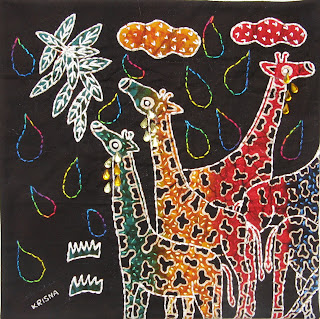
My Mystery Quilt: Tears of the Giraffes


As soon as our Material Mavens theme was announced (and actually I learned about it ahead of time), I knew exactly what I wanted to do.  I have long been a huge fan of mystery books, ever since I first fell in love with Nancy Drew and her red roadster!   At first I was going to base my quilt on an Agatha Christie novel with the name of a pub as its title, THE PALE HORSE; then I thought about others such as CARDS ON THE TABLE or THE CLOCK or THE MOVING FINGER.  All would have been fun to work with!

But then my life took a sudden, sad turn with our daughter's death on February 17, and I had no heart to read any of these mysteries.  (I felt duty-bound to use only a title of a book I had read.)  I needed to read mysteries where no one dies, where there's no even offstage violence--gentler, life-affirming books.  Thus I turned to Alexander McCall Smith's books.  As soon as I spied THE TEARS OF THE GIRAFFE on the library shelves, I knew I had my book.  I brought it home, read it, loved it, and thus this quilt was born.

I used a batik panel by the fabric artist Krisna of five rainbow-colored giraffes.  I had to trim off the necks and heads of two of these giraffes, but one of my fellow Mavens said she loved the look of a piece of art that "goes off the side".  Another mystery:  what are those two giraffes up to?  Actually, one it staring off to the distance, as is the red one, and the other one is nibbling some grass!

Since I can't take credit for the design, I decided to quilt or embellish it heavily with hand embroidery.  I gave myself a challenge:  learn new stitches for this quilt and don't use, anywhere, stitches you already know, such as the stem/outline stitch or French knots.  Chiefly I used the wonderful back stitch, that goes around curves so beautifully, as well as the fly, the seed, and feather stitches.  I used beads for the eyes and scrapbooking "jewels" for the tears of my crying giraffes.

I feel a mite guilty about this quilt, since it truly is NOT an original design, but in all honesty I worked more hours on this one than on any other, with all the embroidery stitching I did!

Here are a few close-ups:

Back stitches along the outlines of the giraffes; see stitches within their coats, in thread
colors that match the colors.

I used a wonderful hand-dye, multi-colored Perle cotton for the
tear-drop shapes that fill the background.  This is a Laura Wasilowski
thread that fellow Maven Carolyn brought me as a gift from
Quilting Adventures this past March.


Friday, April 13, 2012

My Element Quilt

For the Material Mavens internet group that I am a part of, our fourth quilt (which was due March 15) was to depict the theme of "Element."  We had such a great variety of interpretations of this theme!

I chose to go way back to the ancient philosophers, who believed that all the world was made up of four elements:  air, water, fire, and earth.  I decided to do an abstract quilt.  I sketched a number of designs and chose one of them.  Curved lines always appeal to me, and so each of my sketches involved lines that curved and intersected one another.

Once I had my design, I made templates by tracing the shapes the lines formed onto freezer paper.  I used all batik fabrics, selecting blues that reminded me of sky (for "air") and water; for the latter, I had some wonderful fish-motif batiks.  I likewise chose batiks that spoke to me of fire.  And then, fabrics in browns and greens--some with leaf designs, some that looked to me like tree bark--for the Earth quadrant.

I prepared all the fabrics with Wonder-Under, and then I ironed the freezer paper to the fabric and cut the various shapes out with scissors.  These pieces I then adhered to some polyester felt for the batting.  I saw that a few areas needed some additions, so I free-hand cut a few other shapes.

I echo quilted around the shapes, using thread colors that blended in with them.  For the backing--applied after I had quilted--I used what I had first intended to be the front:  a 12"x12"piece that I had string-pieced to tear-away stabilizer, using many of the same batiks but also some regular quilting fabrics.  I loved this design, but it didn't have the abstract look I was seeking, and thus it became the back!  Lastly, I bound the quilt with some pale green batik that appeared in the Earth section of my quilt.

Here is the back of the quilt:

Thursday, February 9, 2012

P.S. to Vincent's Chair: The Quilt's Back


I forgot to say anything in my last post about the back of my Vincent’s Chair quilt.  I deliberately used a fabric that might seem rather discordant, but as a matter of fact, it has a connection to the front.  Provence is famous for its fabrics.  I associate blue and yellow prints with this part of France.  In fact, while in Arles, my sister-in-law and I did a bit of shopping, and I bought some blue and yello Provençal fabric which I am saving for some special project.  I also bought two table cloths and a set of napkins.

So it was fun for me to look through my stash of blue and yellow prints to find one to put on the back of this Provençal quilt of Vincent’s Chair!  This piece was not bought in Provence, but it fits right in.


The back looks a bit odd, with the varying colors of the binding, but of course, they were chosen (as explained in the former post) from the fabrics that lay along the borders of the quilt.

Sunday, January 15, 2012

Today is Reveal Day for our Material Mavens Group!

Alice's South Quilt--Vincent's Chair
I hope all readers of this post will hurry on over to The Material Mavens blog to see the gorgeous quilts that are going up there all day today, January 15.  I am blown away by them.  I thought the first two groups of quilts were wonderful, but it seems to me that our Mavens are really pulling out all the stops on this theme, South, and the results are varied and beautiful.  I can't wait to see them all!

In this post here, though, I thought I'd write a bit more than I did in my narrative on the Mavens blog about constructing my quilt.  I won't repeat what I had to say there, but will amplify it a bit.  I DID think immediately of doing a Vincent Van Gogh quilt, based on one of his works that he did in Arles, where we visited in 2009.  Choosing which one was difficult, though, as I had so many from which to choose!  My final decision was based on the simplicity of the composition of "Vincent's Chair" and the fact that it moved and touched me emotionally.

I loved thinking about Vincent painting this picture of the rush-bottomed, yellow chair in his room, and including the crumpled up tobacco pouch and his pipe.  I had some sprouting onions myself in my kitchen, and that he included a box of sprouting onions in his painting was another homey touch that I loved.

Believe it or not, the simplest part of the quilt was the part I had the hardest time with--the background!  I made three different versions of it before I was satisfied!  The first, the one most faithful to the colors that I could see in the print that I own of this painting, just looked to dull and washed-out to me.  Van Gogh used bright, vibrant colors, and these were too grayed down.  My second version was better, and I actually hand-embroidered the grout in the tile floor and loved that part of it, but that one was rectangular and "framed" with bright yellow fabric, to represent a wooden frame.  But putting that onto a square piece of batting and seeing how odd it looked to have two wide strips at the side and two narrow ones at top and bottom made me discard #2.


Didn't like the background color of the
door but it was nice to
have another chair on which
to practice with my pastels for fabric!

I didn't care for the frame, but I
did love the way I handled
the grout with
hand-embroidery

So I decided to change the proportions of Van Gogh's original work.  I sketched off the painting on graph paper, placing my freezer paper template for the chair to aid me in placing the grout lines on the tile floor:

the sketch on graph paper


I cut out the pieces for the wall, door, and floor using my freezer paper templates:


templates for background and chair's seat


I free-hand cut the onions and their green sprouts from batik fabrics.  After sandwiching the quilt I did the floor stitching, the machine quilting on the wall, several green lines of stitching on the door.  Then I fused and appliqued the box and the chair in my usual way.  Finally, I did what was the "new technique" that I try to employ on each MM quilt--this time, shading and shadowing with fabric pastels.  THIS step was the most fun and gave me the biggest sense of satisfaction in this little 12"x12" quilt.