Wednesday, July 6, 2011

Constructing a Portrait Quilt--Part Two

After I had the cartoon--the enlarged-to-final-size traced image of the photo--it was time to start tracing each boy onto freezer paper.  I started with Dawson, the little boy on the left.  Laying the shiny side down and tracing onto the dull side of the paper, I traced first his clothes and hair.  Then I went back and traced his entire body.  Of course, his body is partially covered by clothes, but I just roughly sketched the hidden areas.

Then I cut out the shorts, shirt, and his hair.  These were ironed down to my chosen fabrics, shiny side of the paper down.  This wonderful product sticks to fabric when ironed but is easily removed.  (And it can be re-used.  I could have used my other patterns from the first quilt, but I am making this one slightly bigger.)

Then I cut out Dawson's entire body, ironed the pattern down on flesh-colored fabric, and then cut it out.  This ends up looking much like a cloth "paper doll"!  I put the body up on my design wall and then dressed my cloth paper doll, laying the various clothing items on top.  Lastly I cut out from my pattern his hair and put it up on his image.  Eventually, I will adhere Misty Fuse, my favorite fusible, to all of these pieces, but that's still another step not yet taken.

In Stein's class I learned a lot about fabric choices!  I had brought for the skin-colored areas a piece of fabric by Maywood Studios, EESO, #513, called "Shadow Play."  This is very flesh-like in color, rather pinkish, but Marcia thought it showed up very well against my yellowish/tan beach fabric.  So I've used that again for the skin areas.  For Dawson's hair this time, I used one of the Stonehenge fabrics from Northcott's Sunshine Cottage line, specifically #3951.  For Dawson's shorts for the first quilt and this time, and probably for the other boys' shorts, too, I've found that Moda Marbles is great.  Its mottled look imitates the shadows on the clothing wonderfully well.  By fussy cutting, I was able to get the dark areas to appear where the shadows are in the photo.  Brown mottled-looking batiks will likely be used for the other two boys' brown hair.

So now some pictures of this second stage of the portrait quilt:

This is the cartoon--the enlargement made at the copy shop


To the left of Dawson now up on my design wall,  you can see my various versions of the photo.
 To the right, the pattern pieces.
I probably should have taken a picture of his
unclothed body, but I'll do that
for one of the other
little boys!
As usual, click to see enlargements!  I do love his shirt!


Constructing a Portrait Quilt--Part One

My last post was about my quilt Lake Michigan Beach Boys and its binding.  I have embarked today on a duplicate quilt, but this one will be for our youngest daughter, whose sons are the boys on the left.  The quilt I am keeping shows Dawson, the youngest boy on the far left, in a red striped shirt.  Very cute, but the shirt he wore in the photo on which this quilt was based (taken by his mother) was a blue and white tie-dye-look tee shirt!  I had the perfect fabric for this shirt, but Marcia Stein, my Quilting Adventures teacher last March, encouraged me to use another fabric, as she was rightfully afraid that that blue would blend into the blue of the lake water.

But I was determined to use that fabric for Susan's quilt!  I will make the water a grayer blue so that the true blue of my beloved fabric will show up against it.

I've decided that to document the stages of making this quilt would be interesting for any readers of this blog.

The first step was to scan the photo, doctor it using Photoshop Elements, and then print it onto plain paper.

I "doctored" in these ways:
The color enhanced photo


1.  I clicked on Auto Enhance, which immediately brightened up the colors.
the gray scale version


2.  I also saved gray scale and black and white versions in my folder for this project.


3.  For my color enhanced photo, I went to Filter, Adjustments, then to Posterize and used level 4.  I did this for both my color image and gray scale one.  (This is helpful to see more clearly where shadows appear.)
the posterized colored version


gray scale, posterized


4. Using the original but enhanced image,  I cropped the two boys on the left and the one on the right, enlarged these images, and printed them separately.  Then I taped the two images together, which made then an enlargement.  Then I traced my enlarged version of the photo onto acetate.  I took the acetate to a copy service and had the traced image enlarged to the size I wanted my quilt to be--about 30" x 36".

the tracing after it was enlarged at a copy shop
This post is getting too long, so I will stop here and discuss the next steps in another post.  Meanwhile, here are some photos that show the picture and its various versions.

Tuesday, June 28, 2011

Artfully Binding an Art Quilt

Two quilting friends came over last week.  One, an art quilter, and the other, a traditionalist.  Both were looking at my 4th art quilt, the Lake Michigan Beach Boys quilt, already discussed here on this blog.
Both quilters immediately zoomed in on the binding and were so struck with it and seemed to admire it greatly!  I do admit that that is one aspect of this quilt's finishing that I am most proud of.


When you click on the quilt--maybe even double click on it--you can see that the binding seems to be a blend into the design.  This involved using six different fabrics.  On my own, I never would have been able to figure out how to accomplish this.  BUT I had a wonderful teacher in Marcia Stein, and she has published a super-helpful book called PICTURE THIS!

On p, 69 of her book, Stein says:  "I like the bindings of my borderless quilts to blend in with the main design.  this is easy enough to do if the seam joining the two fabrics goes straight across.  But sometimes the fabric needs to continue going on an angle through the binding, and this requires a slightly different approach."

I want to avoid copyright infringement, of course, and thus I can't show here (because photos are essential!) how then Stein directs one to approach this tricky situation.  Her photos are essential!  (And I didn't take my own to illustrate this part of the construction.)  All I can advise is "Buy her book"!  This tip alone makes the price of the book worthwhile, but there is much more for any art quilter to gain from owning a copy of PICTURE THIS!  by Marcia Stein, C&T Publishing, 2010.

Tuesday, May 31, 2011

Fellow Quilting Adventure Student's Quilt


Becky Freeman, one of my fellow students in Marcia Stein's class last March at Quilting Adventures, entered her quilt in the Kerrville Quilt Show.  I was privileged to attend this wonderfully diverse show last Saturday, when my husband and some friends of ours spent a Memorial Day weekend in Fredericksburg and Kerrville.  Becky's quilt depicts her husband on the Riverwalk in San Antonio.  She titled her quilt, fittingly, "On the Riverwalk."  This is another quilt in the Marcia Stein style of depicting people from the back!  Becky did a lovely job with the details she added to her quilt after our class and with her quilting.  I also admire the way she handled shadows on her husband's shirt and trousers.  Rather than using the fused tulle as I did, she used darker shades of fabric, it appears to me.  Or perhaps stitching lines.  Whatever method, it is effective.

Another Kerrville friend and fellow QA student, Sue Tune,  was in Philippa Naylor's class.  She, too, entered her small quilt in the Kerrville show.  Her small piece with its lovely trapunto is quite striking.

It was delightful to see the work of these fellow students this weekend in their guild's truly excellent quilt show!

Wednesday, May 25, 2011

ART + QUILT

ART + QUILT is a good book for a novice art quilter.  Author Lyric Kinard's aim is, first, to demystify and to take away the fear many have, many who (like me!) claim not to be true artists!  After her first, pep-talk chapter, she has chapters on the elements of art and the principles of design.

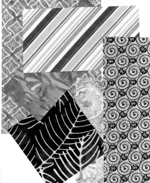
Kinard encourages readers to work through her book in order, starting with the first exercise in the chapter on the elements of art.  And so today I dived into the waters of learning the elements of art.  The first exercise involved Texture.  Following her directions, I first scanned several different fabrics of varied designs and patterns.  After printing these, I then cut out various geometric shapes and arranged these into compositions.

I had great fun!  I got totally lost in the composition process and the time flew by.  Kinard suggests that her readers keep all the products of the exercises in a notebook, in plastic sleeves, and this I will do.  When I buy the notebook and sleeves!  But I plan for this blog to be a diary of my efforts as well.

It was striking and illuminating to me how a black and white image of a colored fabric changed the way I felt about it!  For example, I used chiefly batiks, which are my current fabric passion, but I added in two prints, a stripe and the whirligig one you can see in the triangle at the upper left of the first scan.  I never have liked that fabric particularly, never used it in a quilt, but I love it here!  The triangle below in the bottom right is a scan of the brightest and most vivid of the fabrics, but as a black and white image, it is muddy and not distinctive.

My compositions from this first exercise (called "Visual Texture") are pictured below.  Kinard also encourages readers to ask themselves various questions and make comments on the back of their compositions.  I'll record a few comments in my captions.  The questions I'll ask myself and answer in my notebook later!

This is the first one I composed, and it remained my favorite!

I like the way the other shapes and their textures
look on a larger piece of the scanned striped fabric.

I called this one "All Triangles"

And this one, all circles.  I love this one, too!   I am always drawn to circular shapes!

This one looks too crowded to me.  I used
leftover pieces of all the fabric scans for this one, my least favorite.

I observe about myself here that I am commenting more on the shapes and my reactions to how the fabric looks in black and white, and NOT concentrating on "texture."  I suppose I need now to answer those questions, but I'll do that just for myself.

Art Quilt Four

Lake Michigan Beach Boys


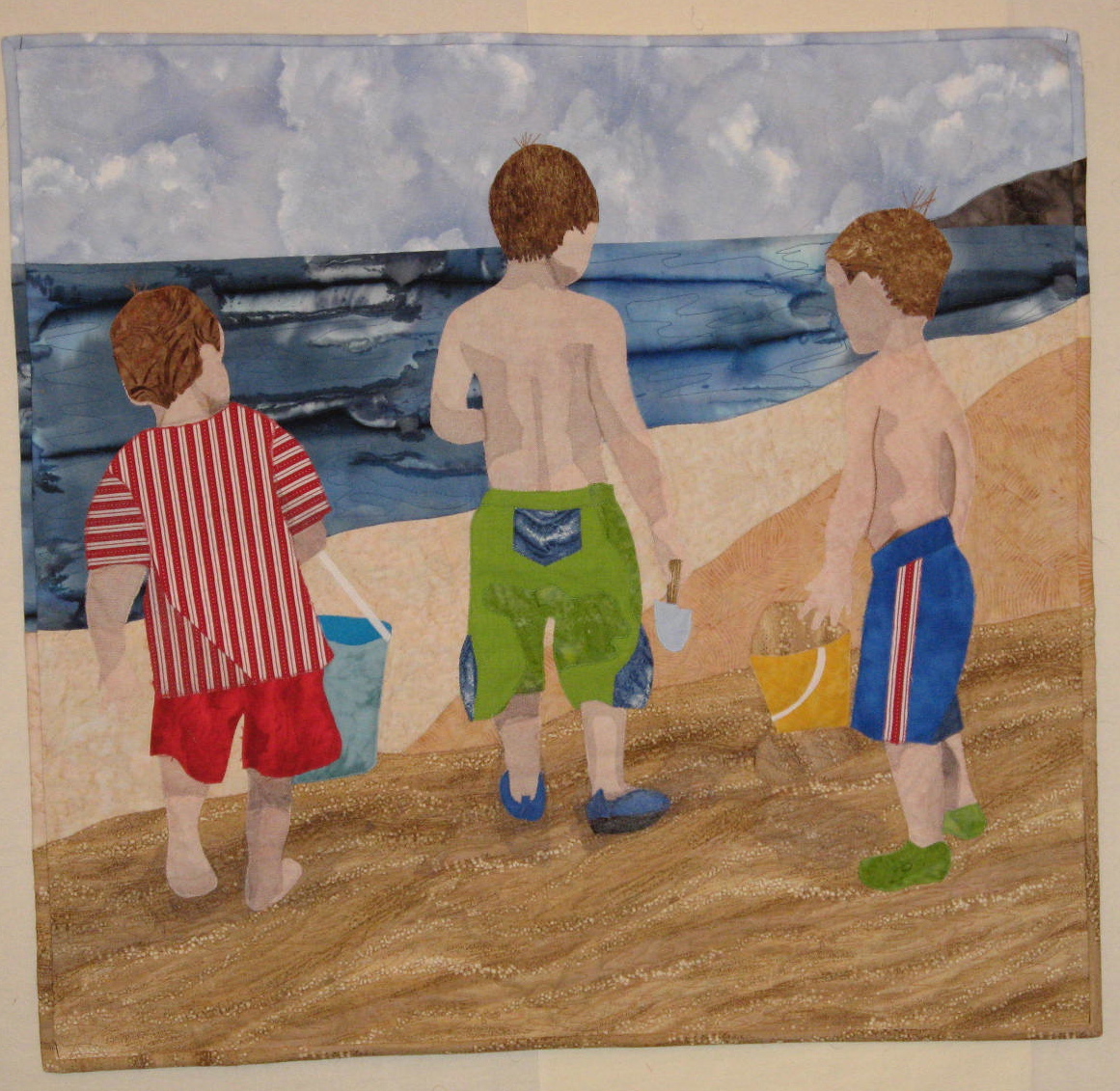
Today I completed my fourth art quilt.  Like all of my art quilts, this one began in a class at Quilting Adventures in New Braunfels, Texas, just this past March.  I was in a class taught by Marcia Stein.  As soon as I read the flyer about Marcia, and saw one of her pictorial quilts--the well-known one of the gondoliers from the back, in their striped shirts, I signed up for her class.  I had long wanted to turn a beloved photo that my daughter had taken five years before, of her two sons and her sister's, on the beach at Lake Michigan.  The three little boys have their backs to the camera.

Marcia proved to as delightful a teacher as the three others I had studied under at QA.  Humorous and laid-back, Marcia was a good sport about the fact that none of us chose to render our quilts using her meticulous method of turned-edge, machine stitched, appliques!  Some of us, veterans of QA, had learned Esterita Austin's raw-edge, fused applique method.  We figured we would more likely LEAVE with a quilt, if we used that method!

Before appliqueing, we had traced on acetate the photograph we wanted to use, and then had it enlarged to whatever size quilt we wanted to make.  We then traced the shapes from the cartoon onto freezer paper, which we ironed onto fabric and then cut out.

I went on and added my 3rd grandson
to Lo's quilt for this
photo!
Constantly circulating among her students, Marcia proved to be an invaluable advisor.  The mood in the classroom was fun and relaxed.  Another Esterita Austin veteran, Lo, pulled a hilarious prank on me when she unpinned two of my appliques from my design wall (while I was in a far corner working on the third boy!) and attached it to her quilt.  I returned and exclaimed, "OH!  WHERE are my two guys?"  The class erupted in laughter, and Marcia turned this event into her opening anecdote on the night she gave her talk and trunk show to the entire group at QA.  We students thought that Marcia's humorous talk was the best of all the teachers' speeches, and ALL were wonderful.

I used my favorite fusible product, Misty Fuse ,to fuse the clothes on the boys and then their bodies to the background.  I did follow Marcia's method of appliqueing, using a tiny applique stitch in the color of the applique, stitching around all edges.  This necessitated changing thread colors often, but no matter; I love the way it looks.

Marcia also had a unique method of creating shadows.  She taught up to use darker shades of tulle, fused on, with our choice of fusible, to wherever shadows appeared on the bodies of our subjects or on the background.

Because I was working on this quilt right before our local quilt show, I couldn't hire Judy Steward to do the machine quilting for me.  She was chair of the show and so snowed under!  I don't enjoy free motion quilting and am not adept, but I bit the bullet and plunged ahead.  I was reasonably pleased with the quilting on the sand areas and the water.  I wanted puffy cloud shapes, though, for the sky, and that defeated me.  So I resorted to hand-quilting these, after cutting out clouds from freezer paper, ironing them onto the sky, and stitching around them.

Marcia's method of binding a quilt was new to me, and one that I plan to use again.  She likes to use the same fabrics as that which abuts the edges of the quilt.  Her excellent, clear instructions, and detailed close-up photographs in her book PICTURE THIS! proved to be invaluable.    I had six different fabrics to use in the binding, and while not an easy chore, it was made doable, thanks to Marcia.   I am most pleased with this, my fourth art quilt.

Some close-ups of the quilt are below:

I enjoyed doing the thread sketching on grandson #3's hair!


This and the one above show the binding, which
blends into the adjoining fabric.


This shows the combo machine and hand quilting.
And it also illustrates the shadowing with tulle.

This is the original photo on which the quilt was based.
I couldn't make the grandson at the left shirt's blue, as Marcia
advised that it blended too much into the lake water!
But the red-striped shirt I did use brightened up the quilt!


Art Quilt Two

Aqua in Abstract--now hanging
on the pale aqua walls of our bedroom!

At Quilting Adventures in 2009, I took a class from Katie Pasquini-Masopust.  In this class we did all sorts of exercises, leading eventually to our choosing a design for a quilt.  I was "stretched" and challenged in this class.  For the first time since I was a teenager, I was drawing and painting. 

But stretching and being challenged is what I wanted, so I persevered.  We began by every student in a cluster of three work tables combining white objects we had brought from home to compose a white still-life.  This still-life we then drew, first as a "blind contour" drawing, then one in which we looked at the composition and sketched it.  We then composed our own still life and did other exercises.

My memory is hazy about just what we did when, but I recall doing a "painting" of the second still life using black (very smelly!) markers and one "positive/negative" composition using construction paper.  One exercise involved taking a water-colored painting, cutting it into squares, and re-assembling the squares into a composition.  I'm sure there were others!

By perhaps the third day of the 4 1/2 day workshop, we each chose two designs we were most pleased with.  Then Katie PM had all of us move from design wall to design wall, looking at one another's choices, and listening to Katie's comments on the designs.  I had put up my very first exercise, the blind contour drawing, and then the positive/negative one.  I preferred the latter, but Katie was frank in liking the first better.  I decided to go with the teacher's instinct!

We then water-colored our final choices, using the palette of colors we planned to use in the quilt.  I had brought a wide assortment of aqua, turquoise, true-blue, and dark blue fabrics.  So I painted my design in these hues.

Then we took our original drawing, re-drew it carefully onto card stock, traced it onto acetate using a fine-tipped marker, had it enlarged, and from that made templates.  We then cut out our fabrics with scissors, just outside the lines of the template, and eventually appliqued these onto a stabilizer.  These were not raw-edged appliques; we used starch to turn under the edges of the "on top" appliques.  We used transparent or invisible thread for the appliqueing, with, I believe, a small over-cast stitch of some sort.

Once my quilt was appliqued, Katie came by and suggested that since some of my colors were very close to one another in value, that eventually I might consider satin stitching between these similarly-valued pieces. When I got home, I serendipitously took a crazy quilting class from master teacher Alice Kolb, and Alice had wonderful pointers for satin stitching, a technique that formerly I had struggled with.

I did the satin stitching over stabilizer, too, and then cut it away, sandwiched the quilt as usual, and took it to my wonderful machine quilting friend, Judy Steward, who quilted it most expertly.

No, this isn't my favorite art quilt, but I am fond of it.  I have wonderful memories of an outstanding art quilting class.  I greatly admire Katie PM and own every one of her books.  It is exciting to read them chronologically, and see how her techniques and her own quilts have evolved!
This is a copy on card stock of my original blind contour drawing.  We made
this in order to have a fairly small rendering to copy onto acetate and then
have enlarged.

This was the water-color that was cut apart and re-assembled.
Not a very exciting design, for sure!
Here was the marker "painting" and the positive/negative
assemblage.

My water-colored design.  I see by all the white areas
that I never finished it!


Finally, here are some close-ups of the quilt that I named "Aqua in Abstract."  Judy's skill at free motion quilting on an"ordinary" sewing machine, puts me, truly, in a state of awe:


Here, on the pale aqua, it shows up well.  I
didn't really "need" the satin stitching
here, but it was addictive and
hard to stop!


Judy's machine quilting can better be seen by
clicking to enlarge!